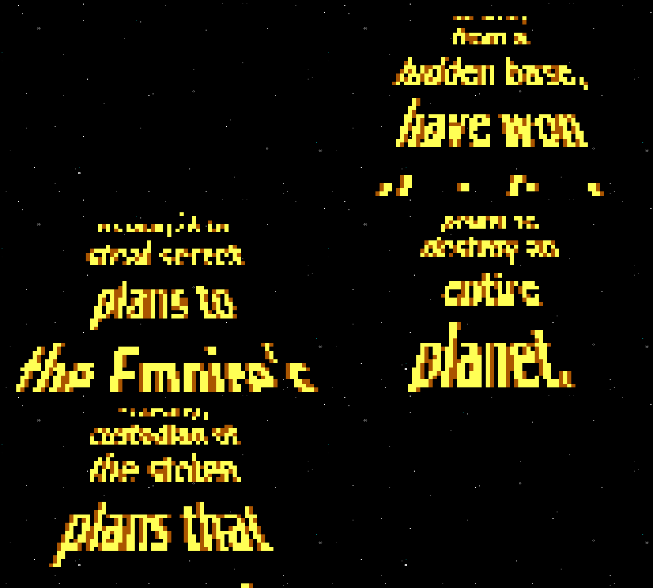
When Star Wars debuted in 1977, the first sequence audiences took in was the iconic opening crawl: a wall of yellow text rolling up the screen, shrinking toward a vanish point in the distance.

This crawl was George Lucas’ homage to the old Flash Gordon serials of the 1930s (which inspired many other parts of Star Wars visual style). Since then, the crawl has become a common trope cribbed by TV shows, computer games, and others.
When I was thinking of ideas I might contribute to Blocktronics’ “Detention Block AA-23” Star Wars artpack, making an ANSI version of the crawl was one of my first thoughts.
I pulled something together. If you’d like to know more about the challenges I faced, keep reading. Otherwise, just enjoy this GIF version of my ANSI Star Wars opening crawl:

(For the Blocktronics artpack, I used this technique to create an animated version of what would traditionally be the .NFO file)
Finding some perspective
The most obvious challenge: how do you even create a perspective effect?
I knew from playing in Photoshop that you can achieve perspective by transforming a rectangle into a trapezoid. But how does Photoshop do that?
Searching on the web, you come across a lot of Star Wars crawl generators. It seems that almost everyone and their brother has written one in HTML5/CSS in the last five years. But these generators all rely on a transform function which is built into CSS. That was useless to me since ANSI has no CSS. I needed the actual algorithm behind that function, so that I could use it on a pixel grid.
For quite a while, my Google searching was fruitless, leading again and again to CSS solutions.
But eventually I learned you can transform a rectangle into a trapezoid by plugging into a very complicated formula the four corners of the source rectangle and the four corners of the destination trapezoid. (This technique will actually work for any quadrilateral shape)
I didn’t really understand the math involved, but thankfully I found some implementations of it, including a very nice one in Javascript by Jenny Louthan.
Making it fit
My initial thought was to duplicate the original crawl. But I quickly gave this up. 80×25 resolution is just too small to fit such long lines of text legibly onto the screen.
Playing in Photoshop, it became clear that I just needed to rewrap the text at a much shorter line length. So, instead of:
    It is a period of civil war.
    Rebel spaceships, striking
    from a hidden base, have won
    their first victory against
    the evil Galactic Empire.
I could use:
    It is a period
    of civil war.
    Rebel
    spaceships,
    striking
    from a
    hidden base,
    have won
    their first
    victory
    against the
    evil Galactic
    Empire.
The look
There are some typographical differences between my crawl, and a true Star Wars crawl. The first is that I don’t justify the text, I simply center it.
Star Wars’ crawls always use “justified text”: the spacing in the line is adjusted so that the letters spread to fill the entire line. This means the entire passage has straight edges on the left and right, rather than a “ragged” edge on the right.
Because I am forced to use such a short line length (around 13-15 characters), some lines consist of single words. Those would look ridiculous if they were justified. So I chose to simply center the text and move on.
Another difference is fonts. The original Star Wars crawls use News Gothic for the main crawl text. However, I decided to go with Verdana, because it was designed to be legible at low resolutions. And it doesn’t get much lower-rez than ANSI.
Anti-aliasing
ANSI offers 16 colors, in “high” and “low” pairs: bright red and dark red, bright cyan and dark cyan, etc. For reds, blues, and grays, you can fudge things by grouping similar colors. You can use the magentas along with the reds to get a bigger red range, for example. But with yellow, you only have two choices: bright yellow and dark brown.
So my options were: Make the crawl a single color (yellow), or make it semi-anti-aliased by adding dark brown. I tried it both ways. Neither is perfect, but I decided I liked the semi-anti-aliased approach better.
One way to get more yellow/brown gradations would have been to use ANSI’s shaded block characters, which let you mix colors.
But because resolution is so low, I chose instead to use ANSI’s half-block characters, which I can treat as pixels, but must be solid colors. This will effectively double the vertical resolution from 80×25 to 80×50.
Putting it all together
So how did I actually assemble the final product?
First, I created a document in Photoshop with the dimensions 80×1000. I used Photoshop to typeset the text, kerning (squeezing) lines or inserting line breaks where needed. Then I exported the image as a three-color PNG file (black, brown, yellow). Finally I converted the PNG into JSON data I can parse in Javascript.
The actual animation is performed in Javascript on my Synchronet BBS.
The script employs two “canvases”: a virtual canvas containing the original image, and the destination 80×25 ANSI terminal screen.
For the shrinking logo animation, I convert the source canvas rectangle into a smaller rectangle on the terminal screen. Each frame, the destination rectangle gets smaller.
For the crawling text animation, I convert the source canvas rectangle to a trapezoid on the terminal screen. These shapes never change size during the animation. Instead, I scroll the original image upwards one line per frame.
Perspective-transform.js does all the math to figure out which pixel of the original source image corresponds to a given coordinate on the destination ANSI terminal screen.
Finally, since I’m using half-blocks as pixels, I wrote a routine to render half-block characters with the correct foreground and background colors by scanning the grid two lines at a time (to get the top and bottom halves of each character).
To make the ANSI file for the Blocktronics pack, I used SyncTerm’s capture buffer to grab all the ANSI and save it as a text file. Programs like PabloDraw will play this ANSI animation, but none of them offer an emulated speed that’s as fast as telnet, so the animation will seem pretty slow.
To make the animated GIF version, my code exports a .BIN file for each frame. Then I use AnsiLove to convert all the BINs into PNGs. Finally I upload the hundreds of PNGs to gifcreator.me, which assembles them nicely into a GIF. I set the delay to ~50ms instead of 500ms, so the GIF is much closer to what you’d experience on the BBS.
WHEW! If you made it this far, thanks for sticking with me. If you’d like to see the animation in a terminal (the way it was meant to be seen), telnet to my BBS: guardian.synchro.net. Go to the “Externals” section and choose “Star Wars demo”.

Share your thoughts!