This is the second part of a multi-part series.
Both Eerie and Don Lokke emerged from opposite ends of the ANSI art spectrum. But … what is “ANSI art”?
Before we can profile the two main subjects of this series or explore their work, it’ll be important to understand the BBSing subculture of the early 1990s. Here are some of the questions I’ll try to tackle in this part:
What was a “bulletin board”? What was “ANSI”? Who were the people doing this stuff, and what were they like? Were there ANSI comics? Heck, how do you even define a comic?
Do you enjoy my retrocomputing histories on Break Into Chat? Please join my email list and stay in touch. 📬
“Brilliant and weird”
Whether ANSI art can be considered a precursor of webcomics remains to be seen. But you can make a strong case for bulletin board systems as the forerunners of the modern internet, as Kevin Driscoll did in his 2022 book, “The Modem World.”
“From the late 1970s until the dot-com boom of the 1990s, dial-up BBSs were the prevailing form of social computing for PC owners,” Driscoll wrote.
Each BBS was like the equivalent of a modern social media website — on an infinitesimally smaller scale.
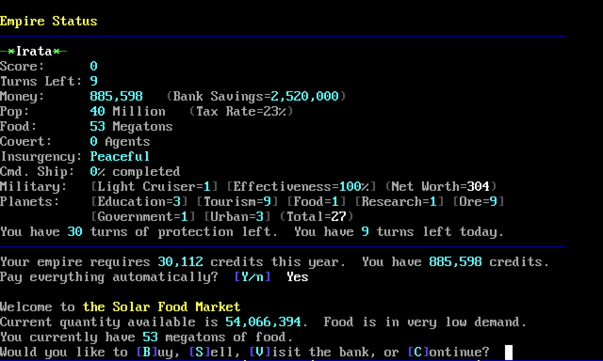
When you connected a BBS, you could send private email (think DMs) or dive into a discussion on a themed messageboard (think Facebook Groups). There were games to play, electronic magazines to read, and libraries of files to download or share.
But BBSes differed greatly from today’s online world in many ways. They were “brilliant and weird,” as Jason Scott, noted archivist and director of the “BBS Documentary,” once put it.
Take the interface for example. Bulletin boards were entirely text-based — no photos, no detailed graphics. And you interacted with them using only your keyboard — no touch screens, no mice, no voice recognition. (There were exceptions, of course)
Each BBS had its own mini Mark Zuckerberg, Jack Dorsey, or Tom Anderson — the person running the board — known as a “sysop.”
For a sysop, setting up a BBS was straightforward enough: install BBS software on your computer, then connect your computer to a phone line with a modem. But it took significant technical know-how, time, and money.
Still, sometimes the hardest part was attracting people to call. How could a sysop set his board apart from all the others in town?
One way: make the board look good.
“A whole different level”
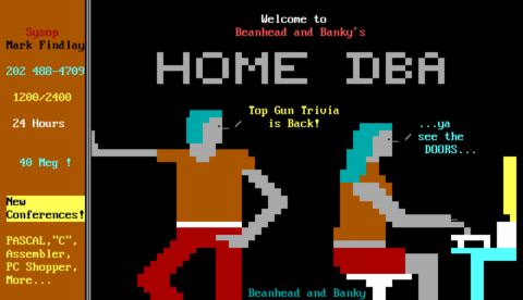
“A customized board with original menus, prompts, and splash screens always drew more attention and interest than a generic, stock setup that looked like it came straight out of the box,” wrote Rowan Lipkovits, founder of the Mistigris artgroup, in a recent retrospective.
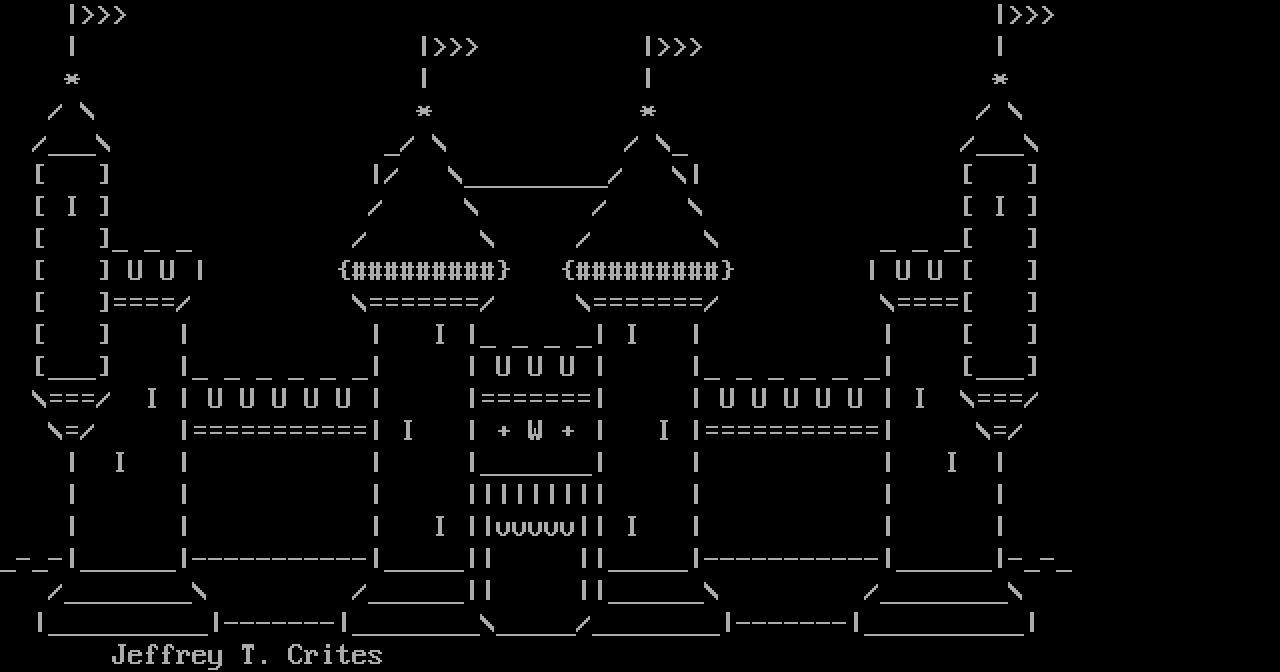
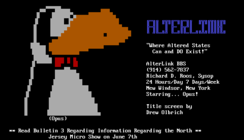
Sysops and users could add illustrations to a text-based BBS by carefully arranging letters, numbers, and symbols on the screen to form rudimentary pictures.
This was ASCII art, the latest in a long line of text art forms going back to teletypes and typewriters.
Most home computers of that time included some extra symbols — triangles, rectangles, bars, lines, shaded blocks — beyond the familiar ones on the keyboard. These “semigraphical characters” made a broader range of text art possible, but they varied from platform to platform. Commodore had PETSCII. Atari had ATASCII.
And then there was the IBM PC. It boasted a particularly flexible extended character set. Even better, it supported special “escape codes” for changing the text color from a palette of 16 colors, or moving the cursor around the screen.
These elements — the PC’s unique characters, colors, and escape codes — became the basis of ANSI art.

At first, it was a novelty that had to be explained to BBS callers. “If you have ‘Ansi control codes’ then this system will look prettier,” read a 1986 help file for Opus BBS software.
“When you first saw ANSI colored text, that’s kind of cool,” said Christian Wirth in a 2002 interview for the “BBS Documentary” film. But so much more could be done with it. And soon, some folks did.
“These people took it to a whole different level that I had never seen before,” Wirth said.
An ANSI art scene was arising, and Wirth, also known as RaD Man, would become one of its driving forces. He was part of “Aces of ANSI Art” (or AAA), the first group dedicated to making ANSI. Then in 1990, he left to co-found “ANSI Creators in Demand” (or ACiD).
ACiD began bundling its members’ drawings into artpacks, and distributing them on affiliated BBSes worldwide. Other groups followed. Years of rivalry, one-upmanship, chaos and creativity ensued.
Then, in the mid-1990s, people began to abandon bulletin boards for the shiny new World Wide Web. By the turn of the century, the once-boisterous ANSI art scene was quiet.
But it never died. People continue to create and release amazing ANSI art today.
Public domain vs. the underground
Historians of ANSI art distinguish between two schools: the earlier art found on legitimate, run-of-the-mill BBSes, often referred to as “public domain” (or “PD”); and the later underground artscene that grew up around boards dedicated to software piracy and other illegal activities.
Though there was overlap, these two camps differed significantly.
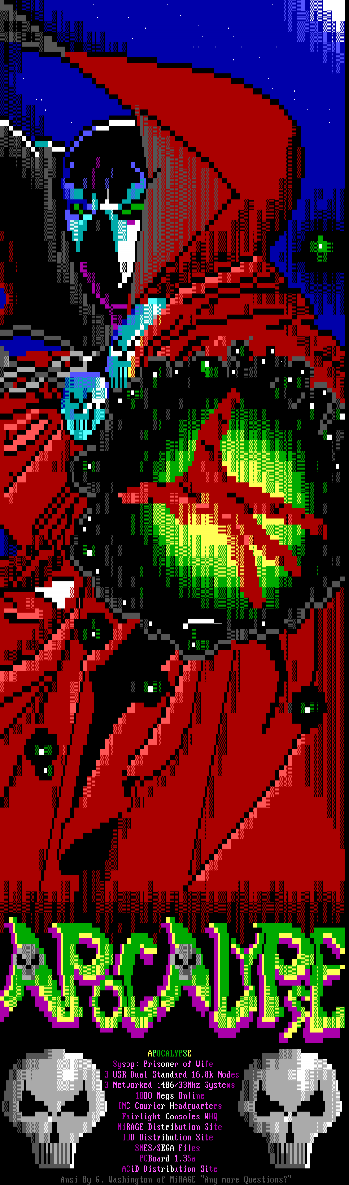
The earlier “public domain” work could be characterized as folk art: simple, utilitarian pieces produced by regular people who seldom had any art training, intended for a small local audience. In contrast, the underground developed into a competitive international scene, producing works with a unique highly stylized look.
If you compare very early pieces with much later pieces, the stylistic differences are stark.
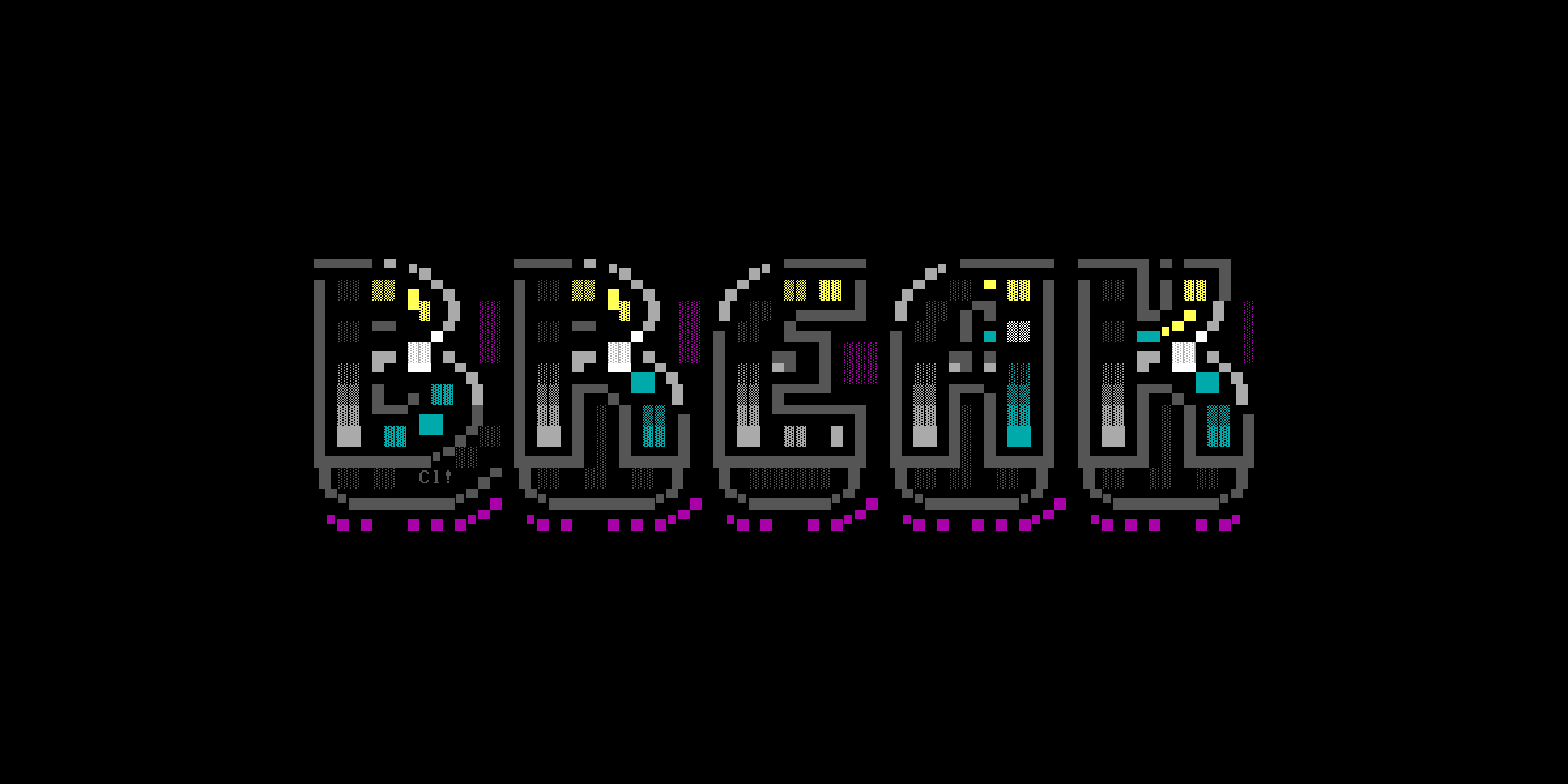
Public domain artists often approached ANSI like pixel art, drawing primarily with solid blocks, either half- or full-size. This gave their work a flat, cartoony look — sometimes even garish. Their canvas was small: a single terminal screen, 80 characters wide and 25 lines tall (or less).

But the underground artists gradually learned to harness the power of shaded blocks. These versatile gradient characters made it possible to add texture, depth, and dimension to their compositions; or to blend colors, or tone them down. The artists also extended their canvases vertically, creating longer and longer pieces that required scrolling through multiple screens to see everything. The extra real estate also meant more room for adding detail. (Click the image at right and zoom in to see!)
Beyond style, there were also big differences in personality.
The public domain artists skewed older, and took inspiration from more mundane interests. Many of them, such as Jean Ludwig and Joseph Crum, signed their work with their real names.
Not so in the underground scene. These artists were young, brash, cliquish. They saw their work as “elite,” prized the anonymity of handles, and made fun of the older crowd and other outsiders as “PD lamers.”
Wirth, the ACiD founder, likened it to the difference between being inside the nightclub and being outside on the street. Underground artgroups were exclusive and conferred status. You needed skill to join, sure, but you also had to survive the politics and the vetting, which might include interviews or a vote.
And once you made it into the underground scene, you left the PD world behind.
“Everything else seemed really boring,” Wirth said.
Comics and cartoons
PD and underground artists alike found inspiration in comics and cartoons. Even so, they liked different stuff.

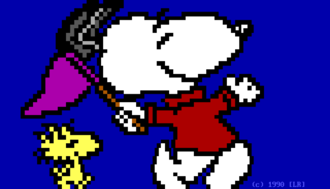
The older crowd gravitated to mainstream characters with simple, iconic looks: the “Peanuts” gang, Calvin and Hobbes, Bart Simpson, Batman, Superman. They were familiar faces, easy to portray in ANSI, and sure to brighten up a bulletin board’s advertisements or welcome screens.
Underground artists drew some of these characters, too, but many gravitated to the darker, edgier material prevalent in the 1990s. When a group of Marvel Comics artists quit and established rival Image Comics in 1992, the scene quickly found a new obsession: Spawn.
Flip through artpacks from the mid-1990s and you’ll find dozens and dozens of depictions of Todd McFarlane’s antihero; there were around 70 in 1994 alone. And you’ll find plenty more of The Maxx, Julie Winters, Savage Dragon, Chapel, and other characters.
Sometimes these were “comic rips,” scenes adapted directly from the pages of the comic books. Other times they were “freehands,” new compositions “born from the artist’s original ideas without reference to an external source,” as Lipkovits put it.
So the ANSI scene was awash in existing comics and cartoons from newspapers, comic books, and television. But did any of the PD or underground artists aspire to create their own ANSI comics?
To get an idea, let’s look at some notable examples; but understand this is not an exhaustive survey.
Original characters
Certainly a few ANSI artists created their own original characters.
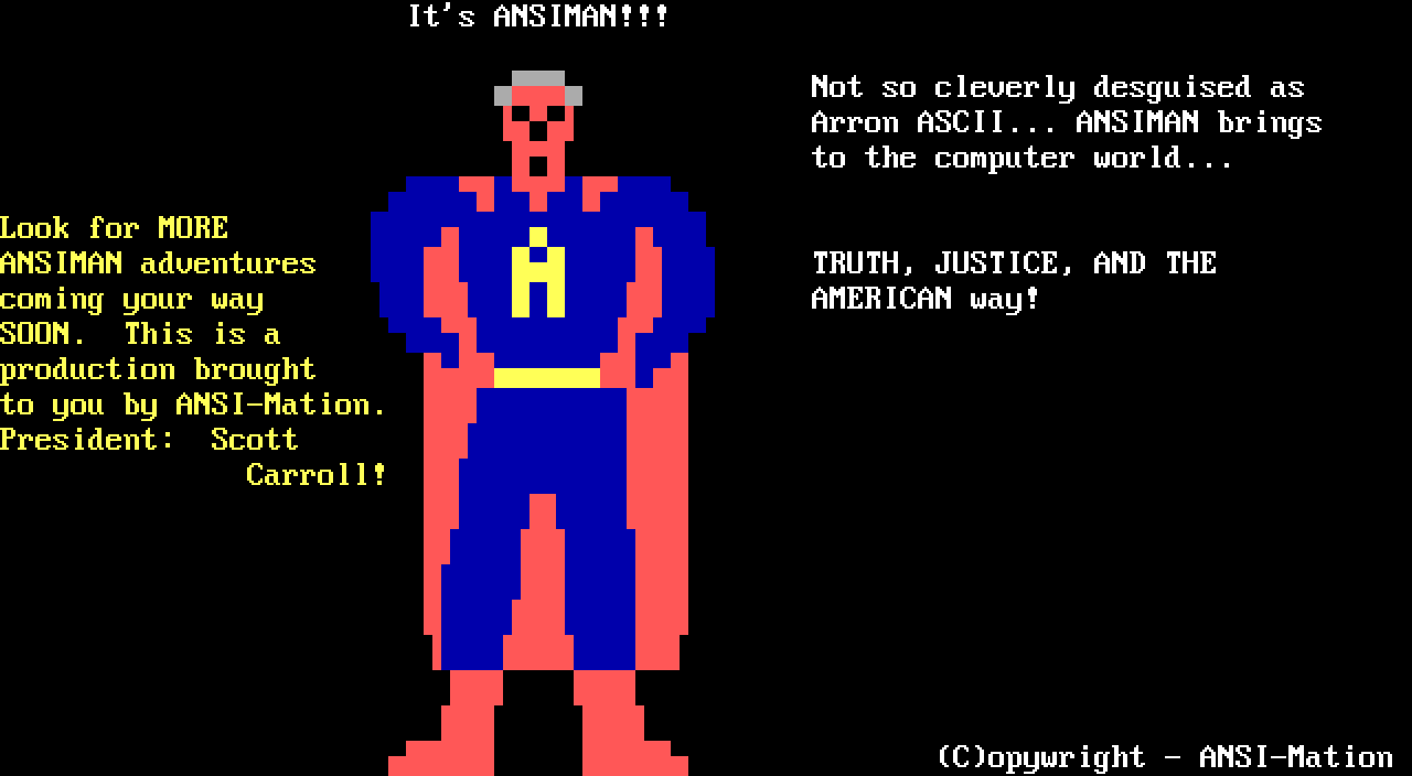
“ANSIMAN” and “INDIANA ANSI”: Around 1989 or 1990, PD artist Scott Carroll (also known as “ANSI-Mation!”) created two series of animations obviously based on Superman and Indiana Jones. These were very short and crudely-drawn animations — each superhero was represented by a smiley-face symbol, rather than drawn in any detail. However, Carroll did make one static portrait of Ansiman, which exists today in two variations (I believe the one above is likely the original).
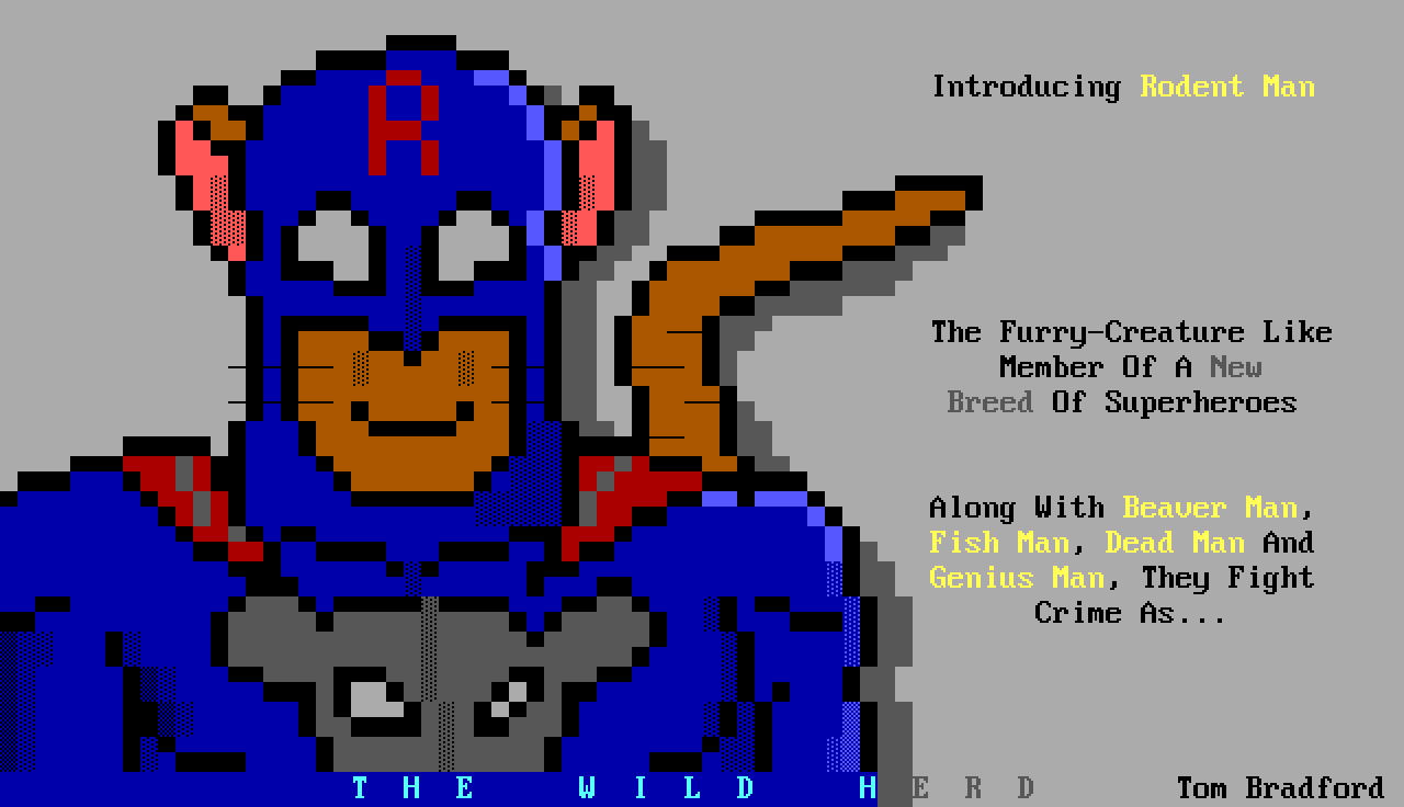
“THE WILD HERD”: In 1990, PD artist Tom Bradford advertised a new group of cartoon superheroes he had created called “The Wild Herd.” Alas, I can find only two portraits of any of these characters: “Rodent Man” and “Beaver Man.” Bradford mentioned three other characters; but if he drew them, their portraits seem not to have been archived.
Were these parodies? Just silly fun? It’s not totally clear. And they don’t appear to have been used to tell any actual stories.

“INSPECTOR” and “NOISE”: As we learned in Part 1 of this series, Eerie created “Inspector Dangerfuck” in June 1994. A couple months later, he created a second original character, “Noise.” We’ll explore both of these in more depth in Part 3.
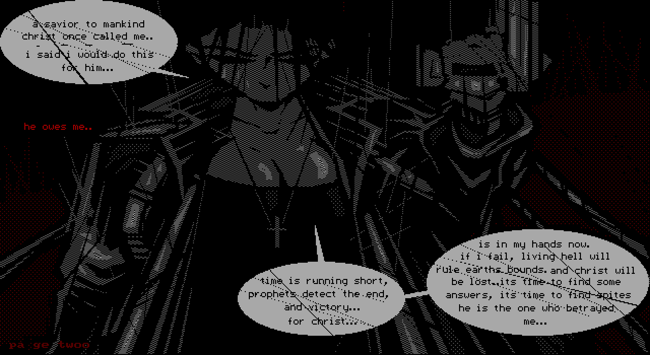
“DIVE”: In 1995, one of the scene’s titans, Lord Jazz, released a solo artpack where he unveiled an original character: “Dive.” The pack included one ANSI drawing of Dive — who appears to have been a sort of resurrected angelic killer — but Lord Jazz’s actual “comic book” was not drawn in ANSI. Instead it was a series of seven images (“pages”), plus titles and credits, in a high-resolution format called RIPscrip. Several of these pages contained multiple panels.
Lord Jazz expressed hope that he would release new installments of Dive’s story monthly, but this promise also went unfilled. However, a few artists (including Eerie) later produced their own ANSI tributes to Dive.
Original story
We shouldn’t ignore “Bart and the Feds,” an animated ANSI cartoon created by Jed and Slash in 1992. It told an original story with a funny payoff using characters from “The Simpsons.” It was very large for an ANSI art file, 1.4 megabytes, due to its lengthy running time and top-notch visuals and animated expressions.
Jed was a member of ACiD. He specialized in animations, employing a toony style. His work earned accolades from across the artscene.
“Jed was the best ANSI animation artist,” fellow ACiD member Tracer said in a 2003 interview. “No one would disagree with that.”
In the same interview, Wirth described “Bart and the Feds” as “groundbreaking” and the “first motion-picture ANSI ever.” Scott, director of the “BBS Documentary,” said many ANSI artists had described it to him as a “seminal work” during interviews for the film.
But Jed himself was self-effacing when asked about his creation.
“It’s a really bad piece of animation,” he told Scott in 2003.
(Eerie seems similarly embarrassed or modest about his work years later, as we’ll see in Part 3.)
Were these comics?
But do any of these ANSI pieces featuring original characters or original stories really qualify as comics? Maybe we should step back and consider — what is a comic?
Most experts agree a comic should have a sequence of visuals that together tell a story.
Famed comics artist Will Eisner described it as “sequential art” in his groundbreaking 1985 book. Nearly a decade later, Scott McCloud expanded Eisner’s idea into a formal definition:
Juxtaposed pictorial and other images in deliberate sequence, intended to convey information and/or to produce an aesthetic response in the viewer.
The very first word in this definition is meant to exclude animations like “Ansiman,” “Indiana ANSI” and “Bart and the Feds.” McCloud uses “juxtaposed” in the sense of “adjacent” or “side-by-side,” arguing that comics and animations are different: the former are sequential in space, while the latter are sequential in time.
Similarly, we can see that these definitions would exclude portraits of characters like Tom Bradford’s “Wild Herd” ANSI drawings since they have no sequence at all.
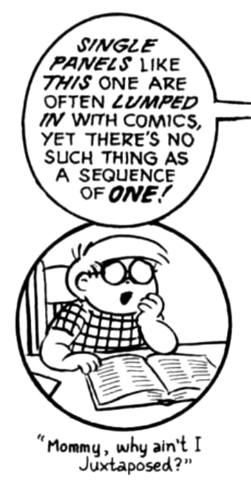
In McCloud’s restrictive view, even beloved single-panel newspaper comics like “The Far Side” or “Bizarro” would not qualify.
“There’s no such thing as a sequence of one!” he wrote in his influential 1993 book “Understanding Comics.”
“They are cartoons … and there is a long-standing relationship between comics and cartoons,” he added. “But they are not the same thing!”
(Not everyone agrees with this particular limitation of McCloud’s definition, as we’ll see in later parts)
At least one of our examples makes the cut. The multi-panel pages of Lord Jazz’s 1995 “Dive” digital comic book do seem to tick all the boxes. This is a comic, though a very short one.
… But “Dive” falls outside our scope because Lord Jazz drew the pages of his comic using high-resolution RIP. It’s an online comic, yes, but not an ANSI comic.
And that leaves us with Eerie’s work, back where we began. Next time, we’ll hear from Eerie and dig into his art.
Up next — Part 3: Eerie and “Inspector Dangerfuck”
Share your thoughts!