So, Star Wars episode VII has a title: “Star Wars: The Force Awakens.”
And while fans everywhere are eagerly discussing the title, I was more interested in the font they used for the title. Nerdy, I know, but I’m a designer by trade.
Star Wars: The Force Awakens has completed principal photography. #StarWarsVII #TheForceAwakens pic.twitter.com/mFTP9YbKNN
— Star Wars (@starwars) November 6, 2014
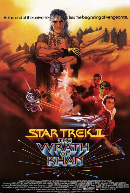
The font is called Serif Gothic. I recognized it because I’m a big fan of the original Star Trek. The font was used for slogans and descriptions in posters for the first several Star Trek movies (which feature memorable artwork by Bob Peak).
| Star Trek: The Motion Picture | Star Trek II: The Wrath of Khan | Star Trek III: The Search for Spock | Star Trek IV: The Voyage Home |
|---|---|---|---|
 |
 |
 |
 |
So, when I saw the title image for “The Force Awakens,” my first thought was: “How odd. They’re using a Star Trek font for the new Star Wars film?”
I was getting ready to tweet about the irony of using a Trek font for the new Star Wars film, when I began to do a little research and I realized how wrong I was.
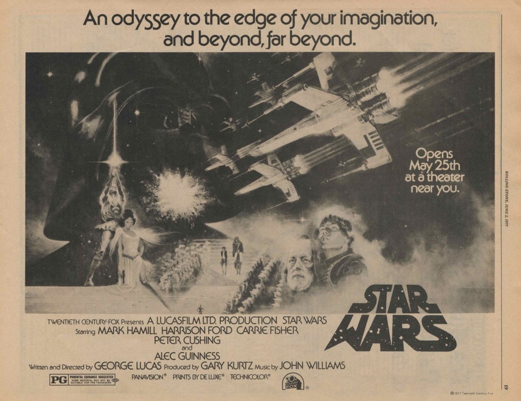
Serif Gothic was pretty pervasive in 1970s and 80s, used on packaging and or in promotional materials for sci-fi and cartoon properties such as He-Man or Starchaser.
But perhaps the most memorable use of Serif Gothic was in some of the early posters for the first Star Wars film. Of course, that means the Trek films followed Star Wars’ lead, not the other way around. I learned something new!
When they rebooted Star Trek five years ago, Abrams and his folks made a lot of little touches like this to connect with the legacy of the original TV show. Obviously they would take care when making similar design choices for this seventh Star Wars film. I should have known.
So, using this font for “The Force Awakens” is in fact a great choice that hearkens back to the original Star Wars.
What about the movie itself? Will it be true to the spirit of the original? We’ll have to wait until next December to see.


Share your thoughts!